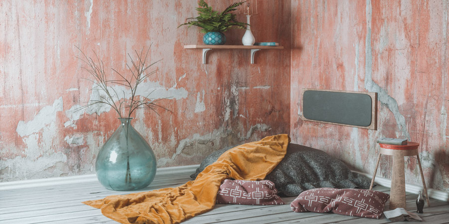
"Place to Relax" is my first interior design project. I created it to get more comfortable with materials and light in Cinema 4D and Octane Render.
In my opinion it is very important to do these personal works to develop the way you think about problems and solutions. Some things may seem pretty simple in your mind and once you started you surprisingly get some headaches. But that's ok. You're not a professional when you have no problems, you're a professional when you can solve them.
Ok, so at first I created all the geometry. The lamp and the big cushion were just dragged and dropped from the C4D library. (Use the search! You don't have to build up everything from scratch every time.)
And then I used different techniques to build the other stuff. Vase and flower pot are splines inside a sweep object. The stool was basically a cone, using some boolean and cleaned it up. The most efficient way I could think of to make the books was scanning some old ones with my Sony Xperia. I used the raw scans here and they are open at the bottom. If I would need them for animation or closeup shots I definitely had to put more time in these scans (closing, retopo, maps etc.) but for that case it worked.

For the blanket I used Marvelous Designer because it's pretty fast and simple for cloth simulation and a nice way to fill scenes easily with organic looking cloths. I exported my scene as .obj (just the parts that are needed for the simulation) and imported it in Marvelous Designer. For more complex simulations please take care of your polycount. I used my high resolution geometry here to save this step.
You can place your cloth in different ways in your 3D view to get different results. And of course you can push and pull it while your simulation is still running.
The material creation was pretty straight forward. As long as you can get high quality textures with all necessary maps you just have to put them in the right material channel and 90% of the material work is done. For example Poliigon and Megascans are selling a nice range for just a few bucks. Most important you have to set up is displacement height (depending on your scene scale), the colors (so everything fits your desired color scheme) and of course the scale of your textures.
If you use Octane Render or anything similar take advantage of the node editor. For example you can control the scale and position of all channels with just one transform node there.
I hope this rough overview helped a bit to get an idea of the scene setup. It always helps myself a lot to see how other artists work. In most cases way more than step-by-step tutorials.
See ya!
RECENT POSTS


